WINNER EXIT: E MOVEMENT
Dear YG Entertainment Art Department,You are doing such an amazing job. These CDs/DVDs are so breathtakingly beautiful. The effort put into these things matches (and honestly, at times surpasses) the actual content of the product. Really, you pay for the packaging. The music and videos, you can get digitally. But you can only fully experience the beauty of the photo books, Polaroids, and everything else when you actually have them in your hands. I've stopped buying CDs of Western artists a long time ago. There was nothing special about them. K-pop albums costs twice as much but you get ten times as much. It's so worth the investment.
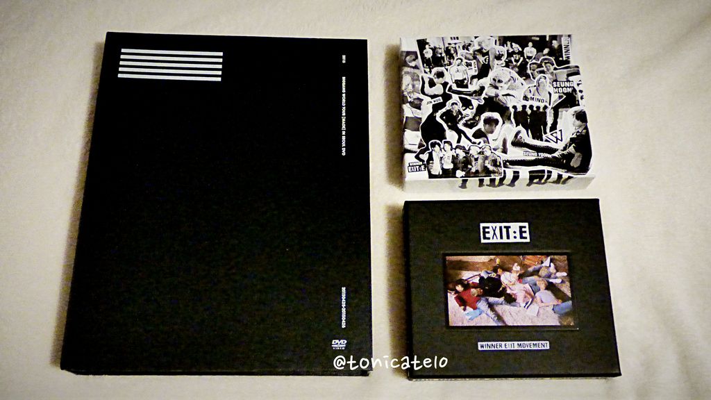
On 20160208, all these goodies came in the mail. At the same time. I have an overflowing shelf full of K-pop stuff. Scratch that... full of YG Entertainment stuff. Mostly BIGBANG DVDs, light sticks, and everything WINNER. I have krunk bears (GD & TOP), a Psy Funko, Epik High's Shoebox, Mix & Match DVD in an actual shoebox, and oh, a bootleg LeeSsang cap. (Do they sell that legit? I mean, I'm saving up for a Halyang one.) All three went on pre-order around the same time. I only "collect" BIGBANG video stuff. There was no question which WINNER Exit:E I'll get. I got all three 2014 S/S editions, didn't I? I also got the free posters from Music Plaza.
In this post, we're celebrating the beauty that is the EXIT: E MOVEMENT mini album.
I have a new camera. A Panasonic Lumix DMC FZ70. I needed a reason to play with it and play pretend photographer. As I opened each item, I almost screamed at the beauty of everything. I squealed and sighed, all happy sounds. I decided that beauty like this must be shared. And enhanced with Fotor for Mac. (All photos are linked to my Flickr.)
This is not an unboxing. I'm not going through the photo books. And I may say something about the content (I still haven't watched the MADE Tour DVD, by the way). But really, I did this because I'm blown away at how amazing these things are. I mean... it's black and white theme. But dang. Really.
Let's start with WINNER's Exit: E - ALEXANDRA PALACE. (It's an actual place, by the way.)
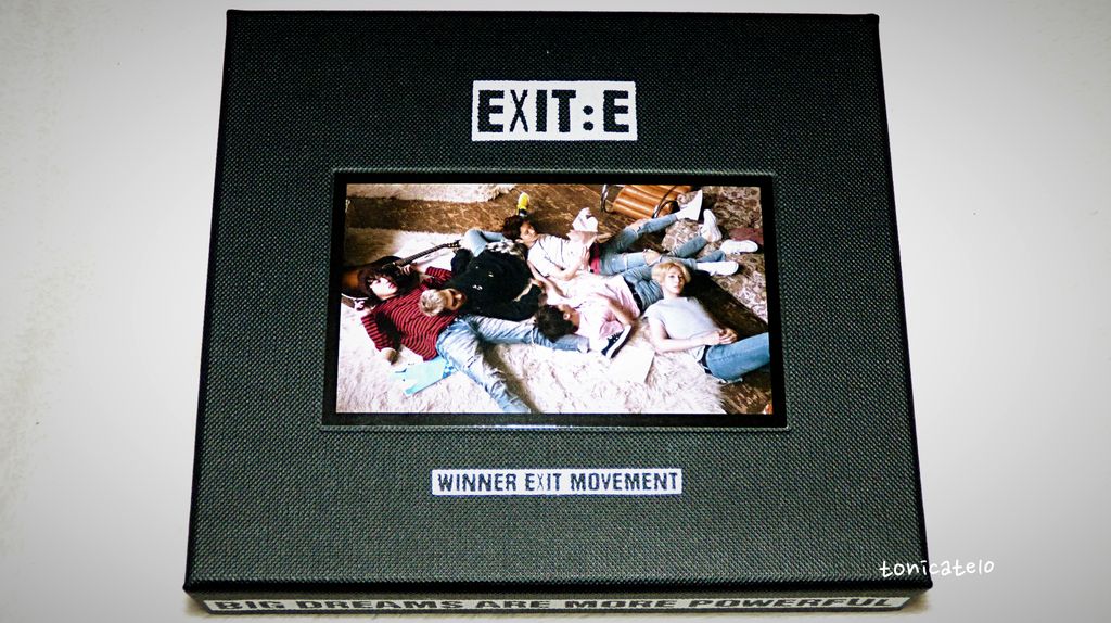
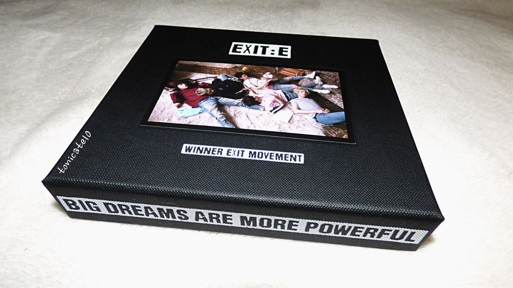
One negative though... Jinwoo is facing away from the camera in this photo. I mean... why? This has a more laid back vibe. I like the denim; the blue serves as an accent. WINNER is always on-point fashion-wise, being marketed by the agency as sort of "model idols". They are all pretty.
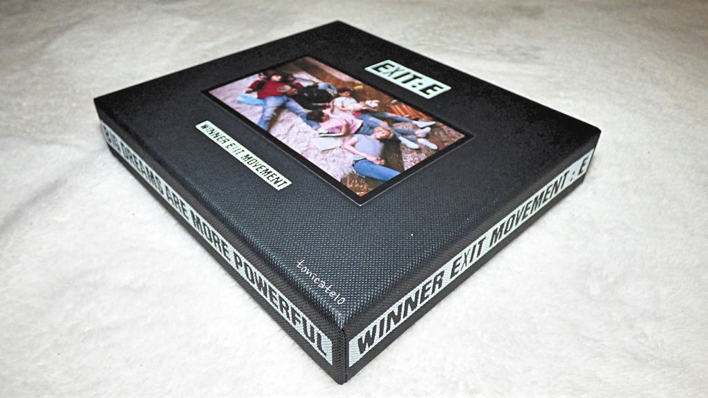
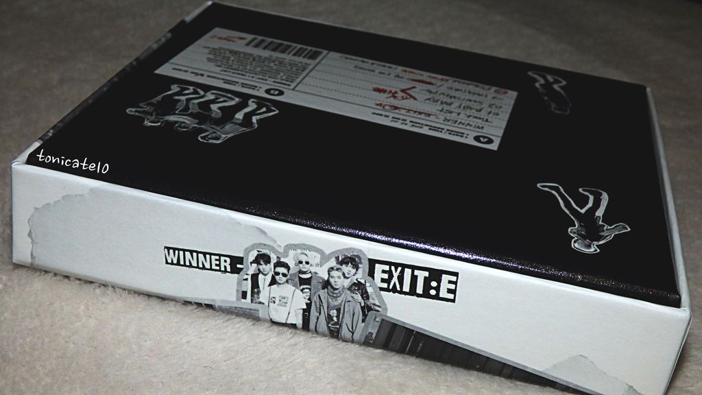
On the edges of the textured black outer box, there are two white bands. On the left and right, the artist and name of the album. On the top and bottom, the quote, "Big dreams are more powerful." Albert Einstein? ;-) WINNER a lot of quotables. In their 2015 Seasons Greetings DVD, they quoted
"Catch the trade winds in your sails. Explore. Dream. Discover," a quote often mistakenly referenced to Mark Twain.
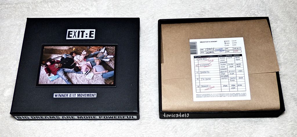
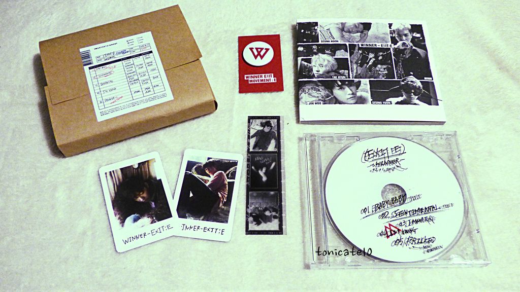
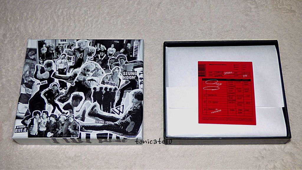
I had no expectations going in. I actually thought it's going to be bigger but it's the size of a standard CD. So I opened it up and this...
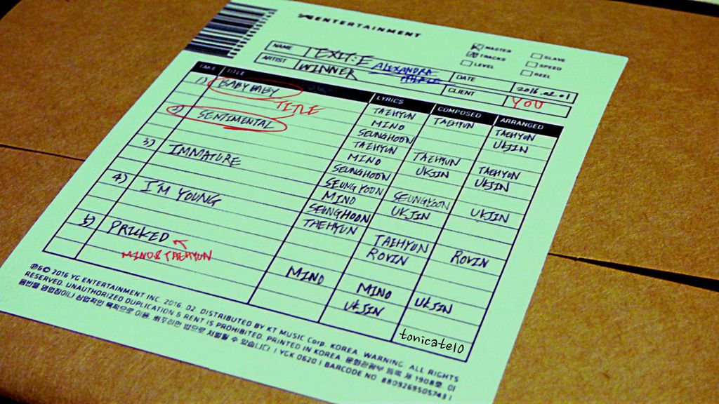
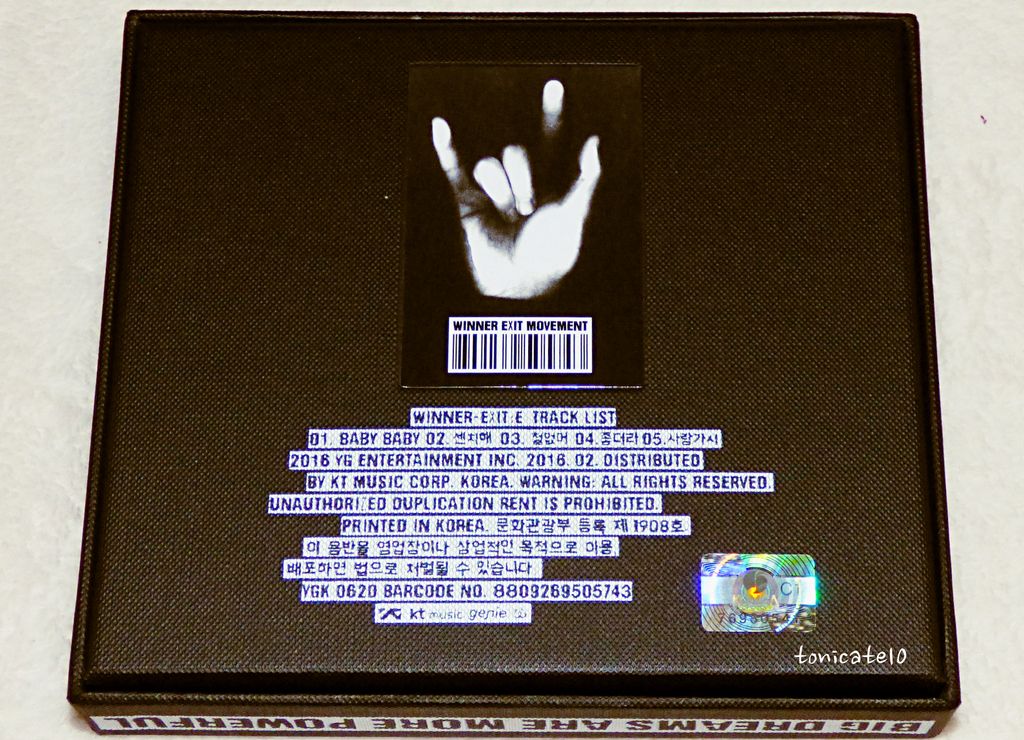
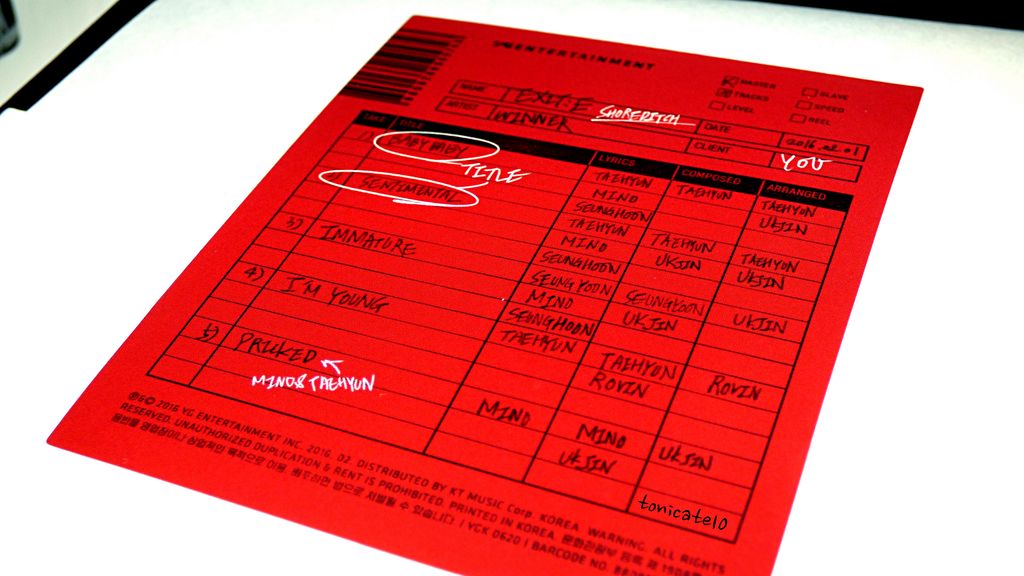
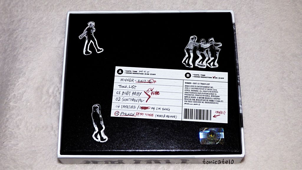
The contents are wrapped in kraft paper, secured with a sticker with the track list and personnel list. The first thing that entered my mind was, "They had to make a sticker and have a person stick this on each unit one by one. Man, that's craft." Okay, they might have an automated system to do that but I'd like to believe that this was done by hand. At least give me that fantasy. LOL.
It looks like an packing slip. It has the release date, who the package is for ("YOU"), special notes in red ink, handwriting font, barcode, YG logo. Just... the attention to detail. Why this concept, I wonder.
I didn't have the heart to wreck the sticker so I pulled on the sides of the bundle to get to the goodies inside.
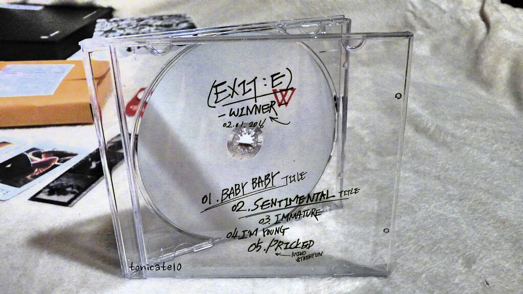
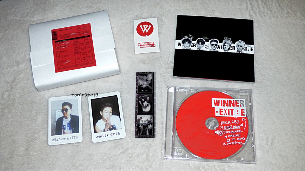
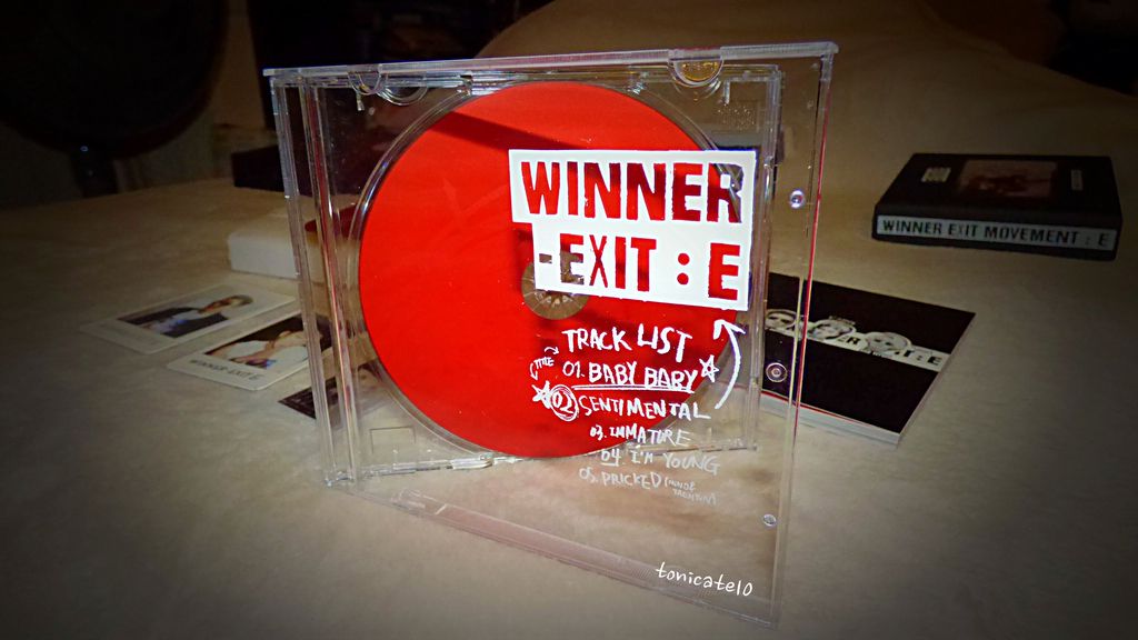
Cue more sounds. So gorgeous. The CD couldn't have been any simpler. It's all white with a red W in a clear jewel case. On the cover is the track list. Alexandra Palace comes with a red on white paper pin. Like I'm going to use that, duh. XD
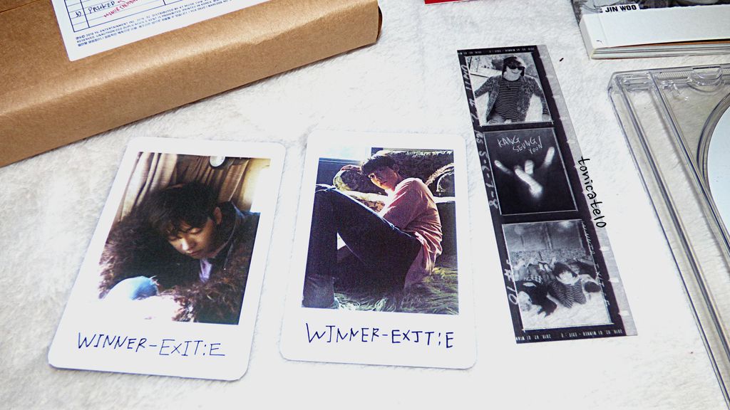
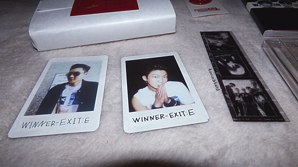
It also comes with a negative, much like the ones in their WINNER TV DVD set. And I got Jinwoo this time. Previously, I've only gotten Seungyoon. Well, I got him on the negative.
Damn, the items are beautiful and the people are equally beautiful. The photo book is awesome, as usual. I'm pleasantly surprised to see that Taehyun played keyboards in Baby Baby. They didn't really say that in promotion materials. Taehyun was all over this album. Good job, maknae!
So clean. So simple.
And yes, I'm never going to even take that CD out of its case. LMAO.
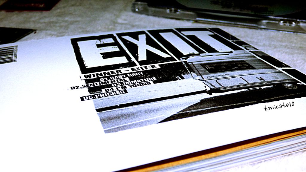
The main photo shoot in Alexandra Palace is done in an RV. Sort of like the one they rode in in an episode of WINNER TV. And also in a house in natural light and just an overall laid back tone.
Shoreditch, also a real place, has more of a street style kind of vibe. Think of G-Dragon's video, Crooked. Graffiti on brick walls, leather, studs, bandanas, fire exits, abandoned performance spaces. It definitely is grungier than the other edition.
I like both concepts. It shows WINNER's style versatility. YG really scored on putting these five men together. Any one of them can be the visual of the group. Of course, their actual visual is one of the most attractive human beings on the planet, Kim Jinwoo. They carry clothes so well and they adapt to any style without it looking like they're trying too hard.
Now, let's look into Exit: E - SHOREDITCH.
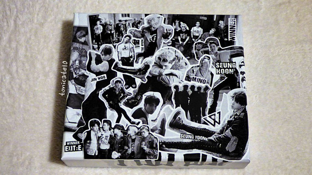
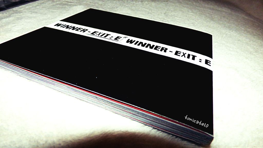
Again, a simple black and white collage. It looks like something the boys would make themselves to show appreciation for each other and Inner Circle. Parts of the top cover have a smooth texture and some have a rougher texture, as if you would put glue on top of it to protect it from peeling.
That goes all the way to the side and the back where the boys' photos are like cut-out stickers.
Shorditch has a white and red interior theme. It looks so clean. Again, with the "handwritten" sticker tracklist label. I was so careful unwrapping the bundle so it won't get crumpled. Well, the sides are inevitable but once it's inside the box, you don't see that, right? ;-)
I wonder whose handwritting this is. I mean, it can be a font but why mess with my delusions, I mean... fantasy? LMAO. It's the same with the previous one except the edition name is different, obviously.
I am in love with how vibrant this is. The pin's colors are reversed in this edition. Again, with the uber simple CD (that I will never play hahaha) and keeping up with the theme of the cover, collaged heads over a sort of police tape in the middle.
I have Seunghoon photos and Taehyun on the negative. Pfft. At this point, I'm only missing MINO. What gives? Gimme my boy! EXIT: X maybe? Hope so.
I love the quotes that they put in this album. It feels natural; not at all pretentious. The Polaroids are candid parts of the whole thing. In the photo book, they're all posed and serious. And they sell that so well.
I've resigned myself that I will always be biased towards WINNER's music. I just love everything about it. So pleasing to the ears and it's not like anything in K-pop yesterday and today. And they write their own stuff! Not to mention, choreograph their own dances. In true middle child fashion, they seem to do everything on their own. (Not that I would know anything about that... I'm the eldest lol.)
What surprised me when they first debuted is that the first lines of their debut stage was SUNG by the RAPPER line. And it sounded GOOD. Hair-raisingly good. MINO had since continued singing on their group tracks. His singing line in Baby Baby is fatal. I wish they would have Seunghoon do more vocally, as much as I appreciate his fluid interpretive-esque dancing style.
Another thing that WINNER does right is line distribution. That's why I stand by my bias that five members in a group is just right. Jinwoo doesn't have a writing credit yet but he has his fair share of lines. I bet the guy can rap decently as well. On top of being incredibly beautiful, you know.
So... which one should you get? I'm not the person to ask that LMAO. I auto-buy anything WINNER audio and video. While I have preferences between editions (White > Black for 2014 S/S Limited Edition), I want to have both. Here, I prefer Shoreditch's interior but Alexandra Palace overall styling. But I won't switch contents to get that "perfect" package. Each element worked nicely with each other giving the patron two sides of WINNER.
I'm so happy they're back. And it also makes me sad to think of how long it's going to be since the next installment. They're not Big Bang level where they can afford to release a couple of songs every month ala-MADE. And even the MADE album is nowhere to be found yet. I won't point fingers here but I just wish that it's that easy... they make a song, release it, done. But these will tide me over until the next DVD. Hee!


